Here's my visual essay. Whats that? You want to know more about it? Wonderful, feast your eyes.
** WARNING: contains some mildly disturbing content.
Part 1: Structure of Argument
The
images chosen for this visual were based on the claim that factory farming methods
used to produce meat are cruel. This claim, supported by the images used in the
visual, rests upon the warrant that the audience cares about the ethical
treatment of animals in general, and views the humane treatment of animals as
being more important than economic benefits of mass meat production. It also
lies on the assumption that the audience is exposed to purchasing opportunities
in restaurants and supermarkets that sell meat that has been produced through
factory farm methods. This visual is intended to educate any and all consumers
of food on the issues with factory farming because it is a process that happens
“behind the scenes” and many are not aware of the conditions their food had
been raised in. Consumers are targeted because they have the choice of buying
meat that was produced using mass farming methods. I am especially targets
teenagers because they are the next generation of consumers and have the power
to set precedents through choosing not to support factory farming.
Part 2: Image and Organization Choices
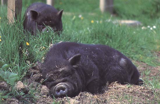
The main
organizational element used in this visual is contrast. I begin by using
pictures that depict a typical consumer’s expectation of meat farming—the open
range, the “old school” way to produce meat (this is made clear through an
“open range” sign that starts off the visual). To add guidance the phrase “once
upon a time” appears at the very beginning of the clip, implying that this type
of open range farming is not what most meat comes from anymore, it is almost
like a fairytale. Each of the pictures in this sequence were chosen to look
cheerful and pleasant, both with the inclusion of bright colors (green grass,
blue sky, even the yellow dandelion in the pig picture) and by choosing
close-ups of animals that look satisfied, as seen best with the smiling cow. I
chose to include a smiling farmer with his cow to show that open range farmers
are more involved with the well-being of their animals, which contrasts with
the industrial, factory-like conditions of the farming shown later. By showing
that animals are happier on the open range, which will greatly contrast with
the harsh, cramped conditions shown later in the video, I am giving a reason as
to why factory farming is cruel (taking away their happiness).
The use of the phrase “but then” signifies a shift in
mood, and transitions into the contrasting evidence. I used a picture of
well-known fast food chains with a picture of a bar-coded cow on top of it (the
logos) to signify the fact that meat was seen only as a product of economic
value, introducing the idea that animals are not treated humanely when they are
raised and produced to be sold. I then introduce the horrible, cramped, unsanitary
conditions of factory farming with images of chickens, pigs, and cattle—the
three types of meat that factory farming has the biggest impact on. The
organization of each type of meat goes as follows: conditions, death,
commonplace food that contains this type of meat (I used fried chicken,
hotdogs, and a hamburger). This shows how the meat is raised and how it gets
into the hands of the consumer. The presentation of death is used to show the
unsanitary and cruel conditions the animals are exposed to on the farms, it is
not meant to be taken literally, however a viewer may. The misconception, for
example, of the chicken in a pile of feathers and manure ending up being the
fried chicken one eats for dinner will work as a disgusting turn off for the viewer.
Or, with the picture of the hamburger, the last food item and the most personal
looking picture, it seems as if the viewer is going to take a bite of that
hamburger, which would be very unappealing to a consumer who now knows (or
thinks he knows) the story behind the hamburger. All pictures of the animals
and their conditions are dark and dreary; the faces of the animals (especially
the cow eating with the other cows) are almost twisted into a frown.
I chose
to include the video of the cow being pushed around by a forklift because it
reinforces everything I am presenting in this visual. It shows that the cow is
in a penned in area with many other cattle, it shows the dirty conditions, and
it, most importantly, flat out shows how terribly animals are treated with the
chains on the animal’s ankles and the treatment from the forklift. This
complete abuse adds shock to the video because it is making the whole situation
real—this actually happens, and now the audience has witnessed it. It draws on
their emotions, making them feel bad for the innocent cow that is being pushed
around. I continue to build on this pity emotion by showing a picture of a
dead, bloody, and dirty cow, which is worse than just a dead cow because it
shows that the cow did not live a comfortable life (also the sad-looking calf
in the background adds to the intense emotion). By showing an advertisement
that asks “how much cruelty can you swallow?” and lists off how the animals are
treated I bring the issue into the viewer’s hands, it is up to him to decide if this is acceptable.
This is supported by a “spotlighted” button saying “you are what you eat.”
Although I end without proposing what to do or what is right or wrong the
readers will most likely be feeling sorrow for the mistreated, miserable
animals (as compared to the happy ones) that they eat every day and maybe will
even take a stand in the movement against factory farming.
Finally,
the overall style of the video is simple. I made many different versions with
these same pictures and this had the most impact because of its style. At no
point are there are other pictures cued up on the side that the viewer can see,
forcing the viewer to concentrate on the image in front of him; he has a better
opportunity to take it all in, and start to develop his opinions on the topic.
Also, this simplicity and focus on the images leads to a build-up of the
emotion of sadness (for the animals) and guilt in the viewer because there is
nothing else for him to avert to, or be distracted by if a sad pictures make
him feel guilty, which is my main goal with this argument!
Part 3: Musical Impact
Like the
organizational style of this visual, I knew that I wanted to have very simple
music. The focus of this project is on the animals and their conditions, a very
serious topic, so I didn’t want any lyrics or dramatic clashing of cymbals or
tooting of horns to distract the reader. Had I chosen a lighter topic such as
current science and its positive success I would’ve chosen a more upbeat,
complicated song to add positive emotional charge and to reflect complexity of
science. The song I chose—Nannou 2 by Aphex Twin—is made up of simple minor
piano chords, each broken up by pauses. I chose an instrumental song because it
does not state my opinion through its lyrics, but it does portray my opinion
through the emotions it provokes in the reader. Its simplicity makes it easy to
twist the mood of the song. At first, with the open range pictures it seems
melancholy, and calm, but it takes on a much more reflective, sad tone when its
minor key, a key that naturally evokes sadness, pictures of horrible treatment.
At some points during the video the notes rise and then fall, ending the phrase
with a low chord. These slow runs add movement in the video, keeping the reader
tuned in, and they also keep the reader attentive because sometimes it seems as
if the end of a phrase will be the end of the video, but then more atrocious
pictures come, putting the emotional endurance of the viewer to test.
Photos used:
Photos used:
Video: "Cheap Meat" (Humane Society) Farming/767131873001/Cheap-Meat/
Music: Aphex Twin (Nanou 2)
No comments:
Post a Comment